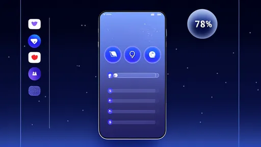
The rise of mobile devices has fundamentally altered how we interact with digital content. Among the most significant shifts is the dominance of vertical screen orientation, which has forced designers to rethink user interface (UI) strategies. One of the most pressing challenges in this space is information density—how much content can be effectively displayed without overwhelming the user. Unlike traditional desktop layouts, vertical screens offer limited horizontal space, making it crucial to balance clarity and functionality.
Vertical scrolling is now the default mode of navigation, but cramming too much information into a single view can lead to cognitive overload. Designers must carefully consider what elements are essential and how they can be organized hierarchically. The goal is to create a seamless experience where users can absorb information effortlessly, without feeling lost or frustrated. This requires a deep understanding of visual hierarchy, typography, and spacing—all of which contribute to optimal information density.
Typography plays a pivotal role in managing information density on vertical screens. Smaller fonts may allow more text to fit on the screen, but they can also strain readability. Conversely, larger fonts improve legibility but reduce the amount of visible content. Striking the right balance often involves dynamic text scaling, where font sizes adjust based on screen dimensions and user preferences. Additionally, line spacing and paragraph margins must be optimized to prevent text from appearing cluttered.
Another critical factor is the use of whitespace. While it might seem counterintuitive, leaving empty space around elements can actually enhance comprehension. Whitespace provides visual breathing room, allowing users to focus on key information without distraction. In vertical UIs, where screen real estate is limited, strategic use of padding and margins can make a significant difference in usability. Overcrowding elements may create the illusion of efficiency, but it often leads to a disjointed user experience.
Interactive elements such as buttons, icons, and menus must also be carefully sized and spaced. Touch targets that are too small or too close together can result in accidental taps, frustrating users and degrading the overall experience. Designers must adhere to established guidelines for touch-friendly interfaces while ensuring that these elements don’t dominate the screen at the expense of content. This delicate balance is especially important in apps where quick interactions are frequent, such as social media or e-commerce platforms.
The rise of short-form video platforms like TikTok has further influenced expectations for vertical UI design. These platforms prioritize rapid content consumption, often at the expense of traditional information density. Users have grown accustomed to minimalist interfaces that focus on a single primary action—scrolling. This trend has led to a broader shift in how other apps approach their layouts, with many adopting similarly streamlined designs to reduce friction.
However, not all applications can afford to minimize information density. Productivity tools, for instance, often require displaying multiple data points or controls simultaneously. In such cases, collapsible menus, tabs, and progressive disclosure techniques become essential. By hiding secondary information behind interactive elements, designers can maintain a clean interface while still providing access to advanced features when needed. This approach ensures that the UI remains adaptable to different user needs without sacrificing clarity.
Accessibility is another crucial consideration. High information density can be particularly challenging for users with visual or motor impairments. Designers must ensure that text remains readable at larger sizes and that interactive elements are easily tappable. Features like adjustable contrast and voice navigation can further enhance usability, making vertical UIs more inclusive. Ignoring accessibility not only excludes a significant portion of the user base but can also lead to legal repercussions in some jurisdictions.
As foldable phones and other innovative form factors enter the market, the conversation around information density is evolving. These devices introduce new possibilities for transitioning between vertical and horizontal layouts, requiring adaptable UI strategies. Designers must now consider how content reflows when a screen unfolds, ensuring that information density remains optimal across different states. This adds another layer of complexity but also opens up exciting opportunities for more dynamic interfaces.
Ultimately, the key to mastering information density in vertical UIs lies in continuous testing and iteration. User behavior varies widely across demographics and use cases, making it essential to gather feedback through A/B testing and usability studies. What works for a news app may not suit a gaming interface, and assumptions should always be validated with real-world data. By staying attuned to user needs and technological advancements, designers can create vertical interfaces that are both information-rich and effortless to navigate.

By /Aug 15, 2025

By /Aug 15, 2025

By /Aug 15, 2025

By /Aug 15, 2025

By /Aug 15, 2025

By /Aug 15, 2025

By /Aug 15, 2025

By /Aug 15, 2025

By /Aug 15, 2025

By /Aug 15, 2025

By /Aug 15, 2025

By /Aug 15, 2025

By /Aug 15, 2025

By /Aug 15, 2025

By /Aug 15, 2025

By /Aug 15, 2025

By /Aug 15, 2025

By /Aug 15, 2025

By /Aug 15, 2025

By /Aug 15, 2025